WE Marketing · TikTok Shop U.S. · Shop Operations
TikTok Shop Storefront Merchandising for Brands
By the WE Marketing Team · Published August 5, 2026
Guide the shopper from arrival to the right product
A strong TikTok Shop storefront does not try to show every product at once. It helps a shopper understand the brand, choose the right path, compare a small set of relevant products, and act with less hesitation. Use TikTok Shop Shop Design to give each visual, product, category, collection, and promotion module one clear job. Then measure the live path instead of judging the page by taste alone.
TikTok Shop discovery often starts outside the storefront. A shopper may arrive from a creator video, LIVE, search result, product card, or an official account. That makes the storefront easy to underestimate. It is not always the first touch, but it can be the place where a shopper decides whether the brand feels coherent, whether another product fits better, whether an offer is real, and whether the shop is worth exploring.
TikTok Shop's current U.S. Academy material describes Shop Design as a free Seller Center tool for customizing a shop page with visuals, products, categories, collections, promotions, headers, and a Brand Story. Sellers can start with an automatic layout or an industry template, or build manually through the editor. The platform also supports preview, saved versions, publishing, and sharing. These are capabilities, not a merchandising strategy. The operator still has to decide what the page should help a shopper do.
WEM's view is simple: storefront merchandising is the operating discipline of choosing which products appear, in what order, for which shopper question, with what proof, and under which offer. Design is the container. Merchandising is the decision system.
A storefront has four jobs, not one
A useful storefront must perform four jobs in sequence.
First, orient the visitor. The header, opening visual, and first product group should answer: Where am I, who is this for, and what is the most useful place to start? A visitor coming from one creator demonstration should not land in a wall of unrelated SKUs.
Second, narrow choice. Categories and collections should reduce cognitive load. Grouping by product type is sometimes useful, but grouping by customer job can be stronger. A skincare brand might use New to the Routine, Daily Essentials, and Targeted Care. A home brand might use Small-Space Upgrades, Quick Cleaning, and Weekend Projects. These are operational examples, not platform-prescribed labels.
Third, build confidence. The storefront must align with product detail pages and creator claims. A banner cannot promise a simple beginner routine while the collection contains advanced products without explanation. A promotion module cannot repair a confusing assortment. Trust comes from a consistent path across content, store, listing, price, and fulfillment expectation.
Fourth, create the next action. The visitor should know which product, collection, or offer to open next. The page can support exploration, but every module still needs a reason to exist.
Start from the visitor job, not the available modules
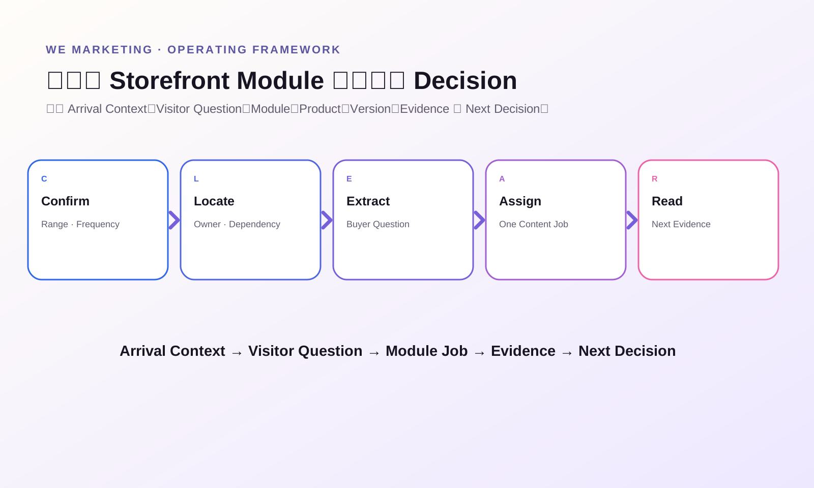
The current Shop Design editor offers modules for visuals, products, categories, promotions, and other shop elements. Starting with the module list often creates a decorative page. Start with a visitor job instead.
Write down the three most common arrival contexts. For example: a shopper saw a hero product in creator content; a shopper searched for a problem; a returning buyer wants a refill or related product. Each context needs a different continuation. The hero-product visitor may need proof and a complementary collection. The search visitor may need a problem-based collection. The returning buyer may need an easy replenishment path.
Then identify the decision question at each step. The opening visual may answer what the brand is known for. A collection may answer which option fits this use case. A product row may answer what most shoppers choose first. A promotion module may answer why now, but only if the offer is current and the economics are approved.
This prevents module inflation. If two modules answer the same question, keep the stronger one. If a module has no visitor job, remove it.
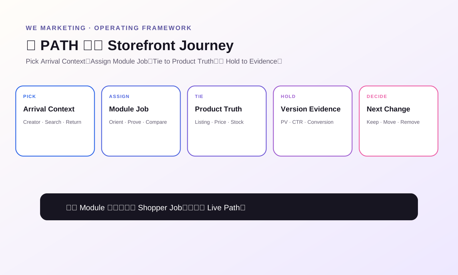
Use the WEM PATH storefront framework
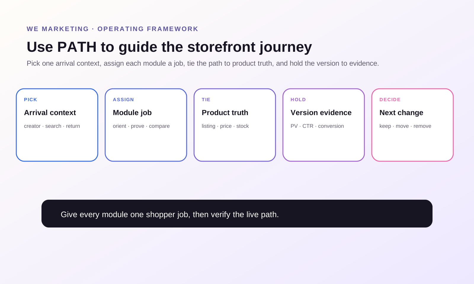
PATH turns storefront design into an operating sequence.
P: Pick one arrival context
Choose one priority visitor for the next merchandising version. Do not design simultaneously for every traffic source, customer segment, and campaign. Use current creator content, product-card traffic, search terms, and shop-page behavior to select the most important arrival context.
A: Assign one job to each module
Label every module with its job: orient, narrow, prove, compare, promote, or continue. The official guide recommends combining visuals, products, categories, and promotions, but combination alone is not the goal. Their order must create a logical decision path.
T: Tie the path to product truth
Check that collection names, imagery, product titles, variation names, pricing, inventory, claims, and delivery expectations agree. Storefront merchandising cannot safely outrun the catalog. If a featured product has weak images, misleading variation names, low inventory, or a mismatched offer, fix the product truth before giving it more prominence.
H: Hold the version to evidence
Preview the page on mobile, publish one controlled version, record the date, and read the current shop-page metrics. TikTok's guide surfaces page views, click-through rate, and conversion rate inside Shop Design. Use those metrics directionally, together with product clicks, orders, traffic mix, and operational readiness. A page is not better merely because the team likes it.
Build one merchandising decision ledger
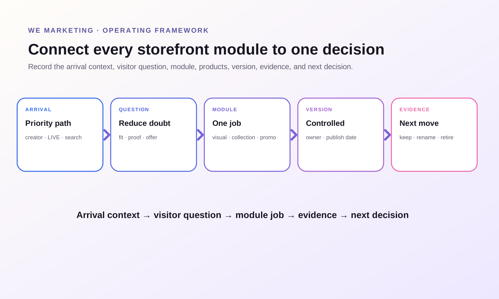
A small ledger keeps the storefront from becoming an unowned creative project.
| Field | What to record | Decision it supports |
|---|---|---|
| Arrival context | Creator video, LIVE, search, product card, official account, or returning buyer | Which visitor path gets priority |
| Visitor question | The uncertainty the module must reduce | Whether the module has a job |
| Module | Visual, product, category, collection, promotion, header, or Brand Story | Which Shop Design control is being used |
| Featured products | Exact product IDs or collection membership | Whether the assortment matches the promise |
| Product truth gate | Listing, price, inventory, claim, and delivery checks | Whether promotion is safe |
| Version and publish date | Draft name, live version, owner, date | Which change produced the readback |
| Evidence | Page view, CTR, conversion, clicks, orders, or shopper feedback | Continue, revise, or remove |
| Next decision | Keep, move, rename, replace, or retire | What happens in the next cycle |
This ledger is especially important during campaigns. TikTok's current guide can surface campaign templates and promotional modules, but eligibility, registered-product counts, current offers, and account availability can vary. Record the live condition instead of copying an old layout.
Choose collection logic by the shopper's decision
Collections are not folders for internal teams. They are shortcuts for customers. The official Shop Design material gives examples such as new arrivals, best sellers, themes, scenarios, styles, audiences, functions, ingredients, and sale groups. The right logic depends on the decision the visitor is trying to make.
Use best sellers when social proof helps a first-time buyer choose a safe starting point. Use new arrivals when novelty is the reason to browse. Use routine or use-case collections when products work together. Use concern-based groups when the shopper begins with a problem. Use price or promotion collections when a real offer is the primary decision. Avoid creating eight nearly identical collections that differ only in marketing language.
One product can appear in more than one path when it honestly serves more than one job, but excessive repetition makes the shop feel shallow. Keep the first screen focused and let deeper collections carry more variety.
Separate evergreen, launch, and campaign versions
One storefront cannot permanently prioritize the brand story, a new product, a seasonal event, a bestseller, and every active discount. Manage versions.
The evergreen version should communicate the stable brand promise and most reliable shopping paths. A launch version can prioritize one new product and its supporting assortment. A campaign version can foreground eligible campaign products and current promotions. TikTok Shop supports live and draft versions, so the team should name, date, and own them.
Before switching versions, verify inventory, price, product eligibility, promotion timing, product-page copy, and customer-support readiness. After a campaign, restore or update the evergreen version. A stale campaign banner is not merely unattractive. It can create a false expectation.
Use headers and Brand Story as proof, not decoration
The current Academy guide says the header can use a logo, brand name, or qualified image, and that the header image can also appear on product detail pages. This makes consistency important. A header should help the shopper recognize the shop without competing with the first buying decision.
Brand Story can support trust when the story answers a relevant shopper question: why the product exists, how it is made, what standard guides the brand, or what makes the assortment coherent. It should not push the shopping path below a long corporate biography. Keep claims specific and supportable. If AI suggestions are available, treat them as drafts that still require brand, legal, and product-truth review.
Promotions belong after product fit
Promotion modules can reinforce intent, but they should not lead a visitor into the wrong product. Confirm the product path first, then place an approved offer where it resolves a real hesitation.
Separate the merchandising question from the discount question. Merchandising asks which product and why. Promotion asks why act now. If the team cannot answer the first question, a discount may increase clicks while weakening margin or raising aftersales risk.
Use the live promotion setup and final checkout result as the evidence gate. Do not assume a banner proves eligibility, stacking, funding, or the final customer price. The storefront should describe only the offer that the current account and order path can verify.
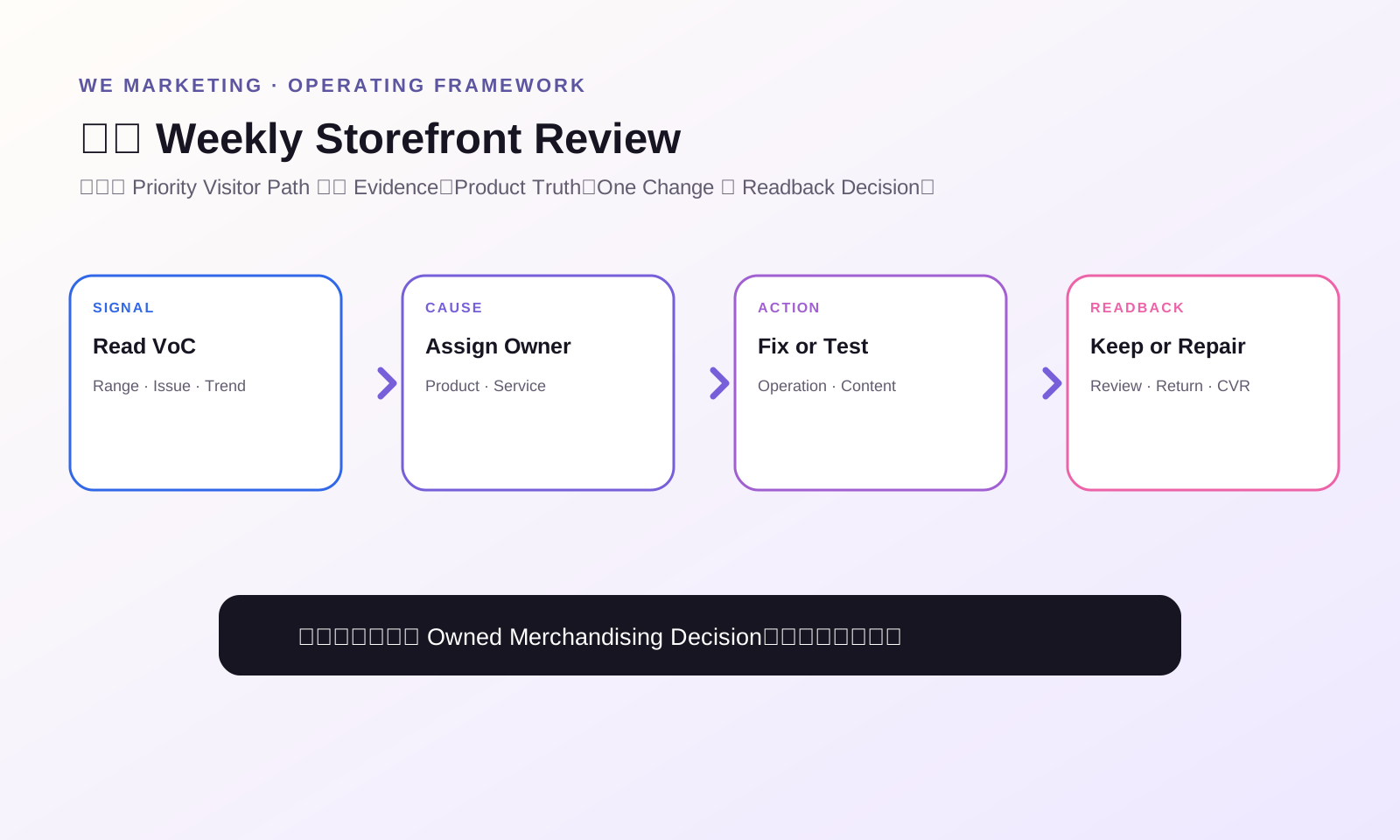
Run a weekly storefront review
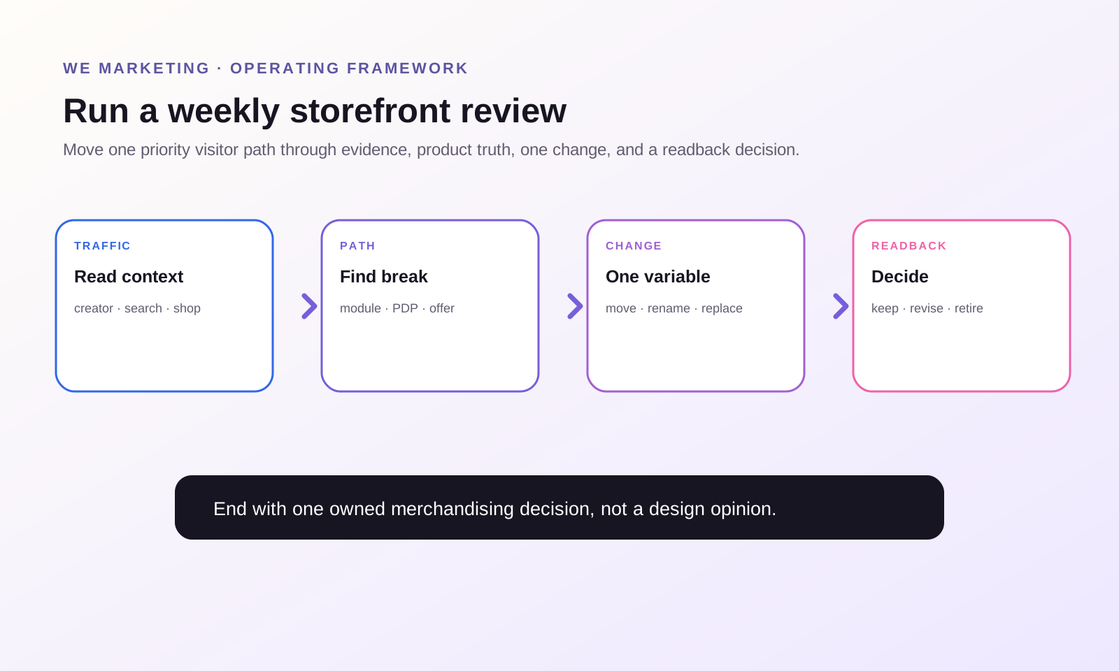
Review the storefront as a cross-functional operating surface, not only a design deliverable.
Start with traffic context: what brought visitors to the shop this week? Then read the live version, page views, CTR, conversion, product clicks, and order mix. Identify the strongest and weakest path. Check whether featured products are in stock, correctly priced, accurately described, and operationally safe to scale. Read customer questions, reviews, returns, and creator feedback for new decision gaps.
End with one decision. Keep the version, move one module, rename one collection, replace one product, or test one new path. Record a readback date. Large redesigns destroy learning because too many variables change at once.
Smallest useful next action
Open the live shop on a phone and choose one real arrival context. Starting at the top, label each visible module with the shopper question it answers. If a module has no clear question, repeats another module, or sends the visitor to a weak product page, mark it for removal or repair. Do not redesign the whole shop today. Fix the first broken handoff in the highest-priority path.
Frequently asked questions
What is TikTok Shop Shop Design?
Shop Design is TikTok Shop's Seller Center tool for building and publishing a customized shop page with items such as visuals, products, categories, collections, promotions, a header, and Brand Story. The exact options visible to a seller should be verified in the current U.S. account.
Should a brand use an automatic layout, template, or manual design?
Use an automatic layout to establish a first version quickly, an industry template when its collection logic fits the assortment, and manual design when the team has a clear visitor path that requires tighter control. In every case, review product truth and mobile flow before publishing.
How many product collections should a TikTok Shop storefront have?
There is no universal number. Use the fewest collections needed to answer the priority shopper decisions. Too few can hide useful paths, while too many create duplicate choices. Start with three to five distinct jobs, then adjust from live evidence.
Should best sellers always appear first?
Not always. Best sellers can reduce uncertainty for first-time buyers, but a campaign visitor, returning customer, or concern-led shopper may need a different first path. Put the collection that best continues the priority arrival context first.
How should promotions appear in the storefront?
Use promotions after product fit is clear. Confirm current eligibility, timing, inventory, economics, and the final customer price in the live account and checkout path. A visual promotion claim should never exceed what the current offer actually delivers.
How do you measure whether storefront merchandising improved?
Record the live version and publish date, then compare page views, CTR, conversion, product clicks, orders, and qualitative shopper signals with the prior version. Change one major path at a time so the team can connect evidence to the merchandising decision.
WE Marketing · TikTok Shop 美国站 · Shop Operations
品牌如何做好 TikTok Shop 店铺陈列与 Shop Design
WE Marketing Team · 2026 年 8 月 5 日
从 Arrival Context 引导用户找到正确 Product
好的 TikTok Shop 店铺,不是把所有商品一次性堆给用户看,而是让用户快速明白这是什么品牌、自己应该从哪里开始、哪组商品更适合当前需求,以及下一步该点什么。Shop Design 里的 Visual、Product、Category、Collection 和 Promotion 都应该承担一个明确的用户任务,再用线上数据验证,而不是只凭团队审美判断。
TikTok Shop 的用户往往不是先进入店铺,再慢慢逛。他们可能先看到达人视频、LIVE、Search Result、Product Card,或者从品牌 Official Account 进入 Shop Page。因此,店铺不一定是 First Touch,但经常承担第二次判断:这个品牌是否可信?视频里的产品是不是最适合我?有没有相关产品?优惠是否真实?值不值得继续浏览?
TikTok Shop 美国站当前官方资料把 Shop Design 定义为 Seller Center 里的免费店铺装修工具。卖家可以添加 Visual、Product、Category、Collection、Promotion、Header 和 Brand Story,也可以选择 Auto-generated Layout、Industry Template 或 Manual Customization,并通过 Preview、Draft、Live Version 和 Publish 管理店铺页面。
这些是平台能力,不是 Merchandising Strategy。真正的运营工作仍然是:决定哪些商品应该出现、以什么顺序出现、回答用户什么问题、用什么证据建立信任,以及在什么条件下展示 Offer。
WEM 的 Operator 视角是:Design 是容器,Merchandising 才是决策系统。
店铺需要完成四个任务,不只是“看起来好看”
第一,帮助用户定位。Header、首屏 Visual 和第一组商品应该快速回答:我在哪里?这个品牌适合谁?最值得从哪里开始?如果用户刚从某个 Hero Product 的达人视频进来,首屏却是一堆无关 SKU,就会打断购买路径。
第二,帮助用户缩小选择。Category 和 Collection 的价值不是把内部 Product Line 原样搬上去,而是减少 Decision Friction。护肤品牌可以按 New to the Routine、Daily Essentials、Targeted Care 分组;家居品牌可以按 Small-Space Upgrades、Quick Cleaning、Weekend Projects 分组。这些是 Operational Example,不是平台规定名称。
第三,建立信任。店铺里的 Collection Name、Visual、Promotion 必须和 PDP、Creator Claim、Price、Inventory、Delivery Expectation 保持一致。页面不能一边承诺“适合新手”,一边把高门槛产品放进同一个入口,却不给任何解释。
第四,引导下一步。每一个 Module 都要告诉用户下一步该打开哪个 Product、Collection 或 Offer。允许用户自由探索,但不等于所有内容都没有优先级。
先定义 Visitor Job,再选择 Module
Shop Design Editor 提供很多可用组件。如果团队先从“有哪些组件”出发,最后很容易做成装饰页面。更稳的方法是先写出三个最重要的 Arrival Context。
例如:用户从 Hero Product 的达人视频进入;用户从 Search 带着具体问题进入;老客户回来补货或找搭配。三类用户需要的 Continuation 不一样。Hero Product 用户需要 Proof 和 Complementary Collection;Search 用户需要 Problem-based Collection;Returning Buyer 更需要 Refill Path。
然后给每一步写一个 Decision Question。首屏 Visual 回答品牌最擅长什么;Collection 回答哪一类产品适合当前 Use Case;Product Row 回答多数新客从什么开始;Promotion 回答为什么现在行动,但前提是优惠真实、库存稳定、Economics 已批准。
如果两个 Module 在回答同一个问题,保留更强的一个。如果一个 Module 没有 Visitor Job,就删掉。
用 WEM PATH 店铺陈列框架
PATH 把 Shop Design 从装修任务变成一套运营顺序。
P:Pick One Arrival Context
先选择当前版本最重要的一类 Visitor。不要同时为所有 Traffic Source、Customer Segment 和 Campaign 设计。结合当前 Creator Content、Product Card Traffic、Search Term 和 Shop Page Behavior,选一个最值得优先优化的入口。
A:Assign One Job to Each Module
给每个 Module 标记一个任务:Orient、Narrow、Prove、Compare、Promote 或 Continue。官方资料建议组合 Visual、Product、Category 和 Promotion,但“组件齐全”不是目标。顺序必须形成一条清楚的 Decision Path。
T:Tie the Path to Product Truth
检查 Collection Name、Image、Product Title、Variation、Price、Inventory、Claim 与 Delivery Expectation 是否一致。Storefront 不能跑在 Catalog 前面。如果 Featured Product 图片弱、Variation 混乱、库存低、Offer 不一致,就先修 Product Truth,再给它更多流量。
H:Hold the Version to Evidence
先看 Mobile Preview,再发布一个可控制的 Version,记录 Owner、Date 与 Change。官方资料说明 Shop Design 页面可以查看 Page View、CTR 和 Conversion。团队可以结合 Product Click、Order、Traffic Mix 和运营承接能力做判断。页面不是“大家都觉得更漂亮”就算更好。
建立一张 Merchandising Decision Ledger
| 字段 | 记录内容 | 支持的决定 |
|---|---|---|
| Arrival Context | Creator Video、LIVE、Search、Product Card、Official Account 或 Returning Buyer | 优先优化哪条路径 |
| Visitor Question | 这个 Module 要减少什么不确定性 | Module 是否有存在价值 |
| Module | Visual、Product、Category、Collection、Promotion、Header 或 Brand Story | 使用哪个 Shop Design 控件 |
| Featured Product | 准确的 Product ID 或 Collection Membership | 商品是否匹配页面承诺 |
| Product Truth Gate | Listing、Price、Inventory、Claim、Delivery 检查 | 是否可以安全放大 |
| Version | Draft Name、Live Version、Owner、Publish Date | 哪次变化带来结果 |
| Evidence | PV、CTR、Conversion、Click、Order、Customer Feedback | 保留、修改还是移除 |
| Next Decision | Keep、Move、Rename、Replace 或 Retire | 下一轮做什么 |
Campaign 期间更需要这张 Ledger。当前官方页面可能显示 Campaign Template 或 Promotion Module,但 Eligibility、Registered Product Count、Offer 与 Account Availability 都可能变化。必须记录 Live Condition,不能照抄旧页面。
Collection 要按用户的选择逻辑组织
Collection 不是给内部团队看的 Folder,而是给用户的 Shortcut。官方资料给出的示例包括 New Arrival、Best Seller、Theme、Scenario、Style、Audience、Function、Ingredient 和 Sale Group。选择哪种逻辑,要看用户正在做什么决定。
Best Seller 适合帮助新用户找到安全起点;New Arrival 适合以新鲜感为主要动机的访问;Routine 或 Use-case Collection 适合需要搭配的产品;Concern-based Group 适合从问题出发的用户;Price 或 Promotion Collection 只有在真实优惠是核心决定时才应该优先。
同一个 Product 可以出现在多个 Path,但不能在首屏反复出现到让店铺看起来只有一个 SKU。首屏应该更集中,更深层的 Collection 再承担 Variety。
分开 Evergreen、Launch 与 Campaign Version
一个店铺版本不可能同时优先 Brand Story、New Product、Seasonal Event、Best Seller 和所有 Discount。团队应该管理不同 Version。
Evergreen Version 负责稳定的 Brand Promise 和最可靠的购物路径。Launch Version 可以突出一个 New Product 与 Supporting Assortment。Campaign Version 可以突出符合条件的 Campaign Product 与 Current Promotion。TikTok Shop 支持 Live 和 Draft Version,因此团队应该给每个版本命名、记录日期并指定 Owner。
切换 Version 前,要检查 Inventory、Price、Eligibility、Promotion Timing、PDP Copy 与 Customer Support Readiness。Campaign 结束后,及时恢复或更新 Evergreen Version。过期 Banner 不只是不好看,它会制造错误预期。
Header 与 Brand Story 要承担 Proof,而不是 Decoration
当前官方指南说明,Header 可以使用 Logo、Brand Name 或合格图片,Header Image 还可能出现在 Product Detail Page 中间位置,所以一致性很重要。Header 的任务是帮助用户识别品牌,不应该压过首个购买决定。
Brand Story 只有在回答真实 Shopper Question 时才有价值,例如产品为什么存在、如何生产、品牌遵循什么标准、为什么这个 Assortment 是一套完整选择。不要把很长的公司介绍放在购买路径前面。所有 Claim 都要具体、可支持。如果账户里可以使用 AI Suggestion,也应把它当 Draft,继续经过 Brand、Legal 和 Product Truth Review。
Promotion 必须排在 Product Fit 之后
Promotion Module 可以加强购买意图,但不能把用户引向错误产品。先回答“买什么、为什么”,再回答“为什么现在买”。如果第一个问题没有解决,Discount 可能增加 Click,却同时伤害 Margin 或提高 Aftersales Risk。
最终证据不是 Banner,而是 Live Promotion Setup 与 Checkout Result。不要因为页面显示某个优惠,就推断 Eligibility、Stacking、Funding 或 Final Customer Price。店铺里只能写当前 Account 和真实 Order Path 能验证的 Offer。
每周做一次 Storefront Review
先看本周 Traffic Context:用户从哪里来到 Shop?再看当前 Live Version、Page View、CTR、Conversion、Product Click 与 Order Mix,找到最强和最弱的 Path。检查 Featured Product 是否有库存、价格正确、描述真实,并且 Fulfillment 与 Customer Service 能承接更多订单。
同时读取 Customer Question、Review、Return 与 Creator Feedback,找到新的 Decision Gap。会议最后只做一个明确决定:保留当前版本、移动一个 Module、重命名一个 Collection、替换一个 Product,或者测试一条新 Path。记录 Readback Date。一次改太多,团队就无法判断到底是什么带来变化。
今天最小但有用的动作
用手机打开当前 Live Shop,选择一个真实 Arrival Context。从首屏开始,给每一个可见 Module 写下它回答的 Shopper Question。如果某个 Module 没有明确问题、和其他 Module 重复,或者把用户送进一个很弱的 PDP,就标记为 Remove 或 Repair。今天不要重做整个店铺,只修最高优先路径里第一个断点。
常见问题
TikTok Shop Shop Design 是什么?
Shop Design 是 TikTok Shop Seller Center 里的店铺页面设计与发布工具,可以使用 Visual、Product、Category、Collection、Promotion、Header 和 Brand Story 等组件。卖家实际可见的功能,仍应以当前美国站账户为准。
品牌应该使用 Auto Layout、Industry Template 还是 Manual Design?
需要快速建立第一个版本时可以用 Auto Layout;Template 的 Collection Logic 与商品结构匹配时可以使用 Industry Template;已经有清楚 Visitor Path 的团队可以用 Manual Design。无论哪种方式,发布前都要检查 Product Truth 与 Mobile Flow。
TikTok Shop 店铺应该有多少个 Collection?
没有统一数字。应该用最少的 Collection 回答最重要的 Customer Decision。太少会隐藏有用路径,太多会制造重复选择。可以先从三到五个不同 Job 开始,再根据 Live Evidence 调整。
Best Seller 是否永远应该排第一?
不一定。Best Seller 对首次购买用户很有帮助,但 Campaign Visitor、Returning Buyer 或带着具体 Concern 的用户可能需要不同入口。第一组 Collection 应该优先承接当前最重要的 Arrival Context。
Promotion 应该怎么放在店铺里?
先确认 Product Fit,再展示 Promotion。团队要检查 Eligibility、Timing、Inventory、Economics 与 Final Customer Price。页面上的优惠表达不能超过当前真实 Offer 能提供的结果。
如何判断 Storefront Merchandising 是否有效?
记录 Live Version 与 Publish Date,再比较 Page View、CTR、Conversion、Product Click、Order 与定性 Customer Signal。每次只改变一条主要 Path,才能把结果连接到具体 Merchandising Decision。